
Perception of colours and shades : a few shades of green
Rhône-Alpes District
2026, March 10 - 09:45 am

© 2026 Jean Guy Lathuilière, All Rights Reserved.
Perception of colours and shades.
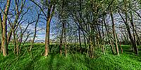
A few shades of green - CMYK versus RGB ? Pantone ® Color Matching System ? What else ? One day, people gave names to colours, didn't they ?
For example, in my panorama I enhanced the saturation of the green, which I tried to make as close as possible to the famous ‘Veronese Green’; later, whilst doing some research, I realised that this green had been created and named two centuries after the painter’s death ! Sometimes, the enhanced green I used, is called "Spring Green" or " Terra Humida Green ", "Landscape Green" or "Morning Green" ...... So, what else ???.... ( I looked up these fanciful names in paint manufacturers’ catalogues in Europe and elsewhere )
Let's keep "Veronese Green", it's a tribute to Paolo Veronese, great painter of the sixteenth century.
We are not all equal when it comes to colours: every human being perceives them differently, and even between our right and left eyes there is a difference in how we perceive the very nature of the colour—whether it is warmer or cooler, or whether the shade is more or less altered. In this case, I am referring to those with a severe impairment of colour perception: those affected by colour blindness.
In another field, the vision of birds of prey is fascinating, with a visual perception of such quality that it allows them to spot small prey from miles away. Great !
Lat: 46° 0' 54.344" N
Long: 4° 3' 42.204" E
Precision is: Medium. Nearby, but not to the last decimal.
Nikon D 850 + Nikkor f:2,8/10,5mm
Handheld, 4 shots
AutoPano Giga 3.0
Photoshop
 Tap or click the zoom icon in the bottom right corner of the picture to switch between in-page and fullscreen view